info@biz4group.com


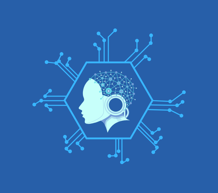
Imagine a digital system that doesn’t wait for instructions but instead, understands your business goals, learns from real-time feedback, and takes independent actions to get the job done.
Read More

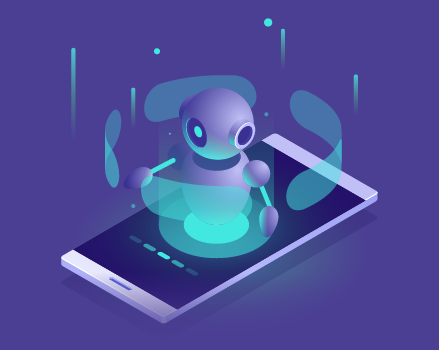
What’s the point of building an AI assistant if no one actually wants to use it?
With AI baked into everything from customer support bots to productivity tools, users expect more than just “smart”.
They want smooth, helpful, and a little bit charming.
If your AI app isn’t intuitive or engaging, it’s just another shortcut to the uninstall button.
First impressions happen fast, and nearly 94% of those impressions are based on design. In today’s AI-saturated world, where new tools drop faster than Netflix originals, a clunky experience isn’t just forgettable... it’s cancelled after one episode.
This guide isn’t about algorithms or code.
It’s about the part that actually makes or breaks your app: design that gets users hooked and keeps them coming back.
We’ll cover:
Whether you're building for productivity, lifestyle, or customer experience, this guide—straight from an experienced AI app development company—will show you how to make your AI assistant unforgettable for all the right reasons.
Let’s go.
Let’s be honest: no one opens an app thinking, “Wow, this backend logic is immaculate.” What they do notice? The look, the feel, the ease of getting what they want. That’s where design takes the lead.
AI assistant apps don’t get a free pass just because they’re “intelligent.”
If anything, the smarter the assistant, the higher the bar for design.
Why? Because users expect:
Here’s what happens when you nail the design:
| Outcome | Why It Matters |
|---|---|
|
Higher engagement |
Users interact more when the UI feels approachable and intuitive. |
|
Better retention |
Clean, delightful design keeps users coming back—and less likely to churn. |
|
Stronger brand perception |
Good design builds trust and positions your AI as capable, not clunky. |
|
Reduced support burden |
If users can self-navigate, you cut down on confusion and customer complaints. |
In short, design isn’t a wrapper—it’s the experience.
And in the AI space, experience is everything.
Let’s break down exactly how smart, thoughtful design drives results that matter to your bottom line:
A well-designed assistant is easy to try, easy to understand, and easy to stick with—key ingredients for adoption, especially among first-time users.
Clear flows and intuitive interaction mean users get what they came for—faster.
That increases perceived value and reduces drop-off.
When users feel like the assistant “gets them,” they're far more likely to come back, recommend it, and stay engaged over time.
You've invested in AI.
Now maximize its impact by wrapping it in a design that actually makes people use it.
Most AI apps get buried in complexity.
A polished, human-centric design makes yours stand out in a crowded market.
Great design removes friction—and friction is a churn machine.
The smoother the experience, the longer users stick around.
Ultimately, design is the trust layer between your user and your AI. Get that right, and everything else—engagement, satisfaction, referrals, retention—starts working in your favor.
Designing an AI assistant isn’t just about giving it a name and hoping for the best. It’s about creating an experience that’s so natural, so intuitive, your users forget they’re talking to software.
Because here’s the hard truth:
If your AI app looks heavy, sounds robotic, or feels like work… it’s not getting a second date. It’s getting deleted.
So what separates the swipe-right-worthy assistants from the ones that ghost your users?
Let’s break it down.
Conversation is the core of any AI assistant. But too many still talk like customer service scripts from 2003.
You need flow.
You need tone.
And yes—you need personality.
Whether users type or talk, it should feel like chatting with a clever (and helpful) human, not arguing with a vending machine.
A good AI assistant UI doesn’t ask users to figure things out.
It shows them.
Think simple layouts, one action per screen, smart visual cues, and spacing that doesn’t feel like it was designed in a rush.
If your users need a tutorial to use it, you’ve already lost them.
Your assistant is part of your brand, not an add-on. Its voice, tone, and behavior should reflect who you are.
Whether it’s empathetic in healthcare, bold in fintech, or playful in lifestyle apps—it should feel on-brand without screaming, “Look at me, I’m quirky!”
Users love assistants that remember their preferences, understand their habits, and offer smart suggestions—without overstepping.
Design can make that feel effortless: surfaced past actions, adaptive shortcuts, subtle reminders.
Give users the feeling that your assistant knows them, but doesn’t stalk them.
Tiny animations.
Taps with feedback.
A visual cue that says, “Got it.”
These are the invisible heroes of great UX. They reinforce trust and give your AI app that smooth, delightful finish.
Subtle, but powerful.
Even the smartest AI will get things wrong. That’s inevitable.
What matters is how you handle it:
Dead ends? Vague errors? That’s how you lose a user for good.
Some users talk. Some type. Some just tap.
Your AI assistant needs to handle all three seamlessly.
Great design isn’t voice-first or touch-first—it’s user-first. That means:
Because the moment your app forces users into one mode, it’s not an assistant anymore.
It’s an inconvenience.
The best-designed AI assistants don’t just “work.” They connect.
They make users feel like they’re getting somewhere—quickly, clearly, and comfortably.
Because at the end of the day, good design doesn’t shout.
It guides.
Ready to Make Your AI Assistant Irresistible?
Not all AI assistants are created equal—and they shouldn’t be.
Designing for a meditation app? Your AI should whisper, not bark.
Building for B2B productivity? Think speed, clarity, and zero fluff.
The point is, your assistant's design should speak the language of your industry and your users.
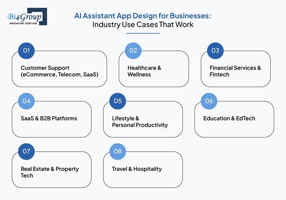
Here's how smart businesses across sectors are using AI and what great design looks like in each case.
The AI Role:
Handling FAQs, order tracking, appointment scheduling, and escalation to humans when needed—these are the essentials of great customer service chatbot design.
Design Priorities:
Bonus tip: Use brand-aligned tone to make even robotic responses feel human.
The AI Role:
Symptom checkers, mental health companions, fitness trackers, medication reminders.
Design Priorities:
In healthcare, trust is earned (and easily lost). Design for reassurance and clarity.
The AI Role:
Whether it's budgeting or fraud alerts, AI financial assistant app best practices demand clarity, precision, and full user control
Design Priorities:
Trust-by-design isn’t optional here—it’s everything.
The AI Role:
Productivity boosters, task assistants, workflow automation, dashboard customization.
Design Priorities:
B2B users don’t want hand-holding—they want results.
That’s why we see growing demand for enterprise-grade AI solutions that streamline work without the friction.
Design like time is money (because it is).
The AI Role: Calendar assistants, habit trackers, shopping helpers, travel planners.
Design Priorities:
The goal here is delight. If your assistant becomes part of the user’s daily routine, you’ve won.
The AI Role:
Virtual tutors, learning assistants, FAQ bots, course navigation helpers
Design Priorities:
As AI teaching assistant tools grow in popularity, UX needs to support natural learning experiences across multiple content formats.
This sector especially benefits from interactive, feedback-driven design—think instant quiz feedback, progress tracking, and motivation nudges.
The AI Role:
Virtual leasing agents, property matchmakers, mortgage calculators, appointment schedulers
Design Priorities:
This space benefits immensely from visually-driven conversations—like an AI design assistant for real estate that can filter listings and showcase properties interactively.
The AI Role:
From trip planners to booking agents, AI travel assistant use cases highlight the value of fast responses and localized flair
Design Priorities:
Travel users want fast answers with flair. The assistant should feel like a concierge, not a help desk—especially in the fast-moving on-demand app space where speed and experience are everything.
The takeaway? Great AI assistant app design isn’t one-size-fits-all.
It’s industry-aware, audience-sensitive, and outcome-driven.
Because when your design aligns with what your users actually need, that’s when assistants become indispensable, and your app becomes unforgettable.
Good design isn’t magic. It’s method.
While AI assistants rely on smart algorithms, it’s the design—the layout, the tone, the flow—that determines whether users stay or bounce.
And no, you don’t need a PhD in machine learning to do this right. What you need is a clear strategy, a deep understanding of your users, and a design process that prioritizes clarity, not cleverness.
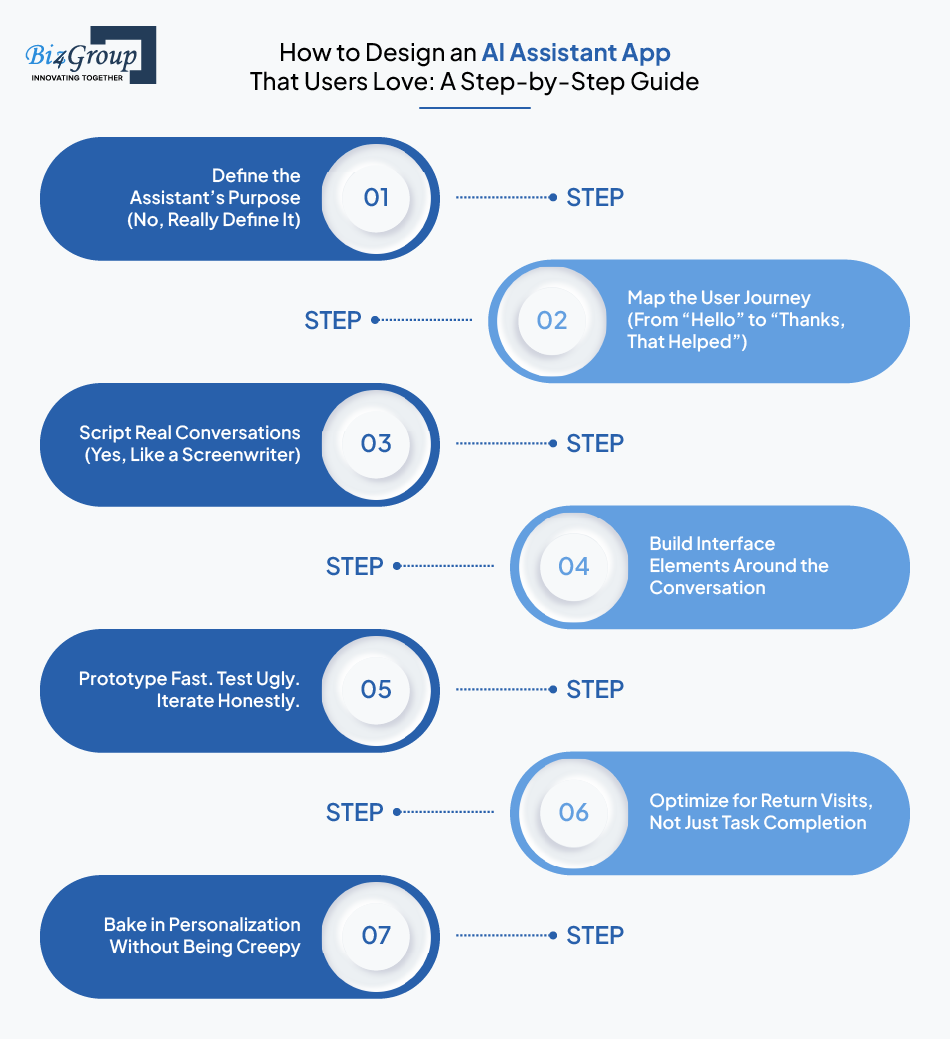
Here’s a clear, step-by-step guide to designing an AI assistant app that users actually enjoy using and keep coming back to.
Let’s kill the myth right here: your AI assistant can’t (and shouldn’t) do everything.
Start by identifying:
Example:
If you're building a productivity assistant for remote workers, is it a task manager?
A calendar bot?
A time-tracking companion?
Be specific. Vague goals lead to vague UX.
Whether you’re looking to create a personal AI assistant or build a task-specific tool, clarity of purpose is the difference between “helpful” and “hard to use.”
Pro tip: Name your assistant only after you've defined its job. Not the other way around.
Once you’ve nailed the assistant’s purpose, zoom in on the user’s point of view.
What are they trying to do, and how do they expect the assistant to help?
Outline:
Use journey mapping tools or even sticky notes. What matters is getting inside the user’s head—not assuming they think like you do.
Now, bring it to life. Design the dialogue, not just the interface.
Think:
Design tip:
Treat every interaction like a conversation with stakes.
If users feel heard, guided, and understood—they’re far more likely to stay engaged.
Bad example:
User: “Book a flight to Chicago tomorrow”
AI: “I’m sorry. I didn’t catch that.”
Instant uninstall.
Better:
AI: “Got it—Chicago tomorrow. Want to fly in the morning or afternoon?”
Conversation-first design doesn’t mean text-only. It means every visual element supports the exchange.
Think:
Design for momentum. The interface should always make the next step feel obvious.
Your first version shouldn’t be polished. It should be quick, dirty, and testable.
Use tools like Figma, InVision, or even clickable slides to simulate the assistant’s flow. Then:
You’re not testing users. You’re testing your assumptions.
The sooner you’re wrong, the better your design will be.
If you're looking for design inspiration or potential partners, browsing through some of the top UI/UX design companies in the USA can offer helpful insight into what great prototyping and iteration really look like.
Getting the job done is good. Getting users to come back is better.
Think about:
Small touches like “Welcome back, want to pick up where we left off?” go a long way toward creating a stickier experience.
Your assistant should learn—but not lurk. Let users know:
Transparency in design builds trust, and trust keeps users coming back.
Long story short, the best AI assistants don’t just answer questions. They build relationships through thoughtful design.
And when you follow this process, you're not just building a tool—you're building a user experience that works so well, it feels invisible.
That’s when users fall in love.
And that’s when your AI assistant becomes essential.
Got a Big Idea but Stuck At “Step 0”?
The line between “cool AI feature” and “can’t-live-without-it experience” is drawn by design.
And while every app is different, successful AI assistants tend to follow a few universal design principles—something a UI/UX design company with deep product experience knows how to tailor for real human interaction.
Below are the best UI/UX practices that separate the forgettable from the fan-favorite.
Your users shouldn’t need a tutorial or a developer mindset to use your assistant.
Use plain, conversational language.
Avoid jargon, even if your AI is doing fancy things behind the scenes.
Make every screen or response answer one simple question: What should the user do next?
This is especially important in first-time use.
If users feel smart using your app, they’ll keep coming back.
AI assistants are not dashboards—they’re digital companions. That means:
Create experiences where users feel led, not lost.
Silence is deadly in AI UX. Users need to see that something is happening.
Smart visual cues include:
These tiny signals build trust. Without them, users assume the app is broken, or worse, ignoring them.
Whether it’s reassuring, playful, or direct—your assistant’s tone should feel like a natural extension of your brand.
But keep it consistent:
A cheerful tone can be great, unless it suddenly turns robotic mid-conversation
A professional assistant shouldn’t suddenly start dropping emojis or slang
Design the tone intentionally. Document it like you would a brand guide.
Microinteractions are subtle design moments that say, “Hey, I heard you.”
Examples:
These moments are tiny, but they create satisfaction, rhythm, and user confidence.
AI will mess up sometimes. That’s expected. But how you handle it?
That’s where great design shines.
Instead of “I didn’t get that,” try:
Bonus: visually surface fallback options (buttons, menus) to prevent dead ends.
Great UX includes everyone:
Accessibility isn’t a bonus. It’s a baseline.
If you're planning a build or redesign, understanding the cost of UI/UX design helps align expectations with the quality and depth of experience you want to deliver.
If users have to re-explain themselves every time they return, your design has failed.
Design should:
This builds continuity and loyalty.
When done right, UI/UX design becomes your AI assistant’s secret superpower.
It’s the layer that turns logic into loyalty, automation into delight, and users into long-term fans.
Designing an AI assistant app is like directing a play where the script changes mid-scene, the actors improvise, and the audience expects perfection. It’s a high-stakes UX balancing act, and when it goes wrong, users don’t complain… they uninstall.
Below are the most common design challenges product teams run into, along with practical ways to fix them before your users walk away.
The assistant is live.
The UI looks polished.
But users still stare at it like it’s waiting for them to make the first move.
This is one of the most common failures in AI UX—the “blank canvas” problem. When users aren’t told what the assistant can do, they either freeze or fumble.
The fix?
Design with gentle hand-holding.
Use example prompts, onboarding overlays, or contextual hints that help users take that crucial first step.
You’re not just launching a product—you’re teaching users how to think with it.
One moment, it’s friendly and chatty. The next, it's all business.
Inconsistent tone confuses users and undermines trust fast.
Your AI assistant is part of your brand. It needs a clear, consistent voice that reflects your values and your audience’s expectations.
Professional doesn’t have to mean robotic.
Casual doesn’t have to mean cringey.
What matters is that the tone doesn’t zigzag between them.
Lock in your assistant’s personality like you would a brand voice guide and make sure every word, from greeting to error message, speaks with the same voice.
Nothing frustrates users faster than this: they ask a question or issue a command, and the assistant responds with “I don’t know” and nothing else.
That’s not a conversation. That’s a wall.
Instead, build in graceful recovery.
If the assistant doesn’t understand, it should offer alternatives, ask for clarification, or even admit its limits (“I’m still learning, but here’s something that might help…”).
When users feel guided—not rejected—they’re far more likely to stick with it.
Cramming every feature into the home screen may feel “complete,” but for users, it’s cognitive chaos.
Buttons everywhere.
Options they don’t understand.
Visual overload.
Resist the urge to impress with complexity. Instead, start simple and introduce features gradually. Progressive disclosure—showing the right tools at the right time—keeps things clean, usable, and confidence-boosting.
Remember: minimalism isn’t boring. It’s strategic.
When an AI assistant forgets your last question—or fails to follow up on something it promised—users start treating it like a glorified FAQ.
That’s a fast way to kill engagement.
Continuity matters.
Your assistant should remember user preferences, revisit unfinished tasks, and pick up where things left off.
Even simple “Welcome back, want to continue?” moments go a long way toward building trust—and the illusion of intelligence.
AI can be powerful. But if your design doesn’t explain what the assistant is doing—or how it’s using personal data—users will back away fast.
Transparency is the antidote. You don’t need to display your model architecture, but you do need to show the “why” behind each interaction and how data is used—seamless AI integration that doesn’t alienate users but earns their trust.
Put data and decision-making in plain sight. Trust doesn’t come from being flawless. It comes from being clear.
These challenges aren’t signs of failure—they’re design invitations. Invitations to rethink, simplify, clarify, and connect.
Because when AI assistant design gets it right, users stop thinking about the interface altogether and just start getting things done.
Your Assistant’s Got Issues, We’ve Got Answers.
You’ve seen the toughest challenges and how to conquer them. But let’s be honest, sometimes the real trouble comes from shooting yourself in the foot.
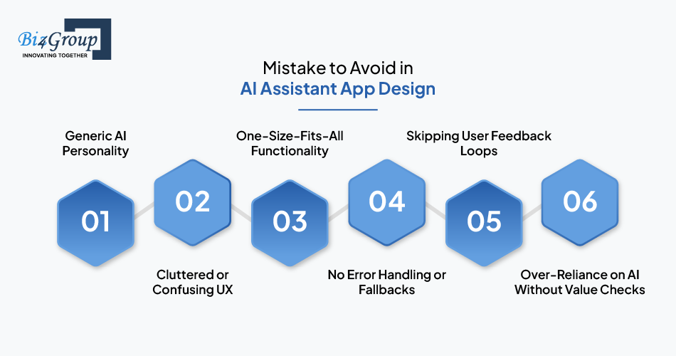
Before you write a single line of code or feed your assistant its first prompt, make sure you're not walking into these painfully common mistakes. Because great AI assistant app design isn’t just about what you build—it's also about what you don’t.
Your assistant shouldn’t sound like a robot from 2012.
If the tone is bland or inconsistent, users lose interest.
Great AI assistant app design includes voice, tone, and intent that reflect your brand.
A polished interface means nothing if users can’t get things done.
Overloading your assistant with too many options, nested commands, or unclear pathways kills usability.
Keep it simple, clean, and purposeful.
Trying to make your assistant everything to everyone? Don’t.
AI-powered apps perform best when focused on specific user goals.
Design around core use cases, not a wishlist of features.
What happens when the AI doesn’t understand?
If your assistant hits a dead end, the experience tanks. Plan for uncertainty—misfires, misinputs, and weird edge cases.
Design graceful fallbacks.
No matter how well you plan, users will surprise you.
A good AI assistant app collects usage insights and user feedback to evolve over time.
Without that loop, your app stagnates—fast.
AI is powerful, but it’s not perfect.
If your app relies too heavily on AI-generated responses without guardrails or business logic, it can go off-brand or off-topic.
Balance automation with human-defined rules.
Smart AI assistant app design isn’t just about tech—it’s about intuition. Avoiding these common missteps can save you months of rework and keep your users coming back.
Design isn't just about how things look—it's about how they perform. And in the world of AI assistant apps, performance means one thing: engagement.
But let’s be clear—vanity metrics won’t cut it.
Just because someone downloads your app or opens it once doesn’t mean they’re actually using (or liking) it.
To really measure whether your UI/UX is working, you need to track metrics that reflect user behavior, satisfaction, and stickiness.
Here’s what matters most.
This measures how quickly a user completes their first successful interaction with the assistant.
The shorter the TFTT, the better your onboarding and initial design flow.
If users stumble here, your app might feel confusing or unwelcoming—two fast tracks to churn.
These are your pulse checks.
High DAU and WAU numbers suggest users are finding value, fast.
But don’t just track the count—look at usage patterns.
Are users coming back for the same features?
Are they exploring new ones?
Are they dropping off after the first few days?
Patterns matter more than peaks.
Want to know if your AI assistant is forgettable or indispensable? Retention rate tells you.
A steep drop-off after Day 1? Your onboarding or UI might be off.
Low Day 7 numbers? Users aren’t seeing enough ongoing value.
Flatlines by Day 30? Your app’s design isn’t creating long-term habits.
Design should evolve as retention dips reveal where you're losing people.
Not all features are created equal.
Which parts of your assistant do users actually use—and which do they ignore?
If adoption is low for high-value features, the issue may not be functionality. It could be design: poor visibility, unclear copy, or confusing flows.
Use heatmaps, event tracking, or funnel analysis to identify what needs improvement.
This is a usability goldmine. It tracks how often users successfully complete a task using your assistant.
A low success rate means users are either:
Watch this metric closely during beta testing and post-launch updates.
Quantitative data tells you what’s happening. CSAT and NPS help you understand how users feel about it.
Add quick surveys after tasks or at session end:
You don’t need long forms—just short, in-context questions that yield useful feedback.
Don’t underestimate the power of open-ended input.
Reviews, in-app comments, and even support tickets can highlight UX flaws you won’t catch in the numbers.
What you’re looking for:
Use this to prioritize design fixes, not just feature requests.
Good AI app design doesn’t just look good—it performs.
And these metrics are your reality check. They tell you what users love, what’s not working, and where your next design sprint should start.
Tracking KPIs But Still Losing Users?
Designing an AI assistant app that truly engages users isn’t just about clever flows or sleek screens.
It’s about strategy. Insight. Empathy.
And that’s exactly where Biz4Group steps in—not just as a vendor, but as your trusted advisors.
We’re a US-based software development company with a sharp focus on building business-driven, user-first digital experiences.
From startups looking to disrupt the norm to enterprises scaling smarter tech, we help brands turn AI into a competitive advantage—by designing interfaces that actually get used, loved, and remembered.
At Biz4Group, we don’t just design apps—we design engagement.
Our team blends deep technical know-how with design thinking to create AI-powered products that feel effortless, intuitive, and on-brand—powered by years of mobile app development expertise across industries.
Here’s why businesses trust us:
We think like users, build like engineers, and advise like partners.
We don’t just take your brief—we question it, challenge it, and elevate it.
We specialize in AI and emerging tech.
Whether it’s generative AI, voice assistants, or conversational tools—we’ve built it, refined it, and launched it successfully. We’re often recognized as a top mobile app development company for translating innovative ideas into powerful digital solutions.
We design for outcomes, not aesthetics.
Our UI/UX approach is rooted in behavioral psychology and performance data, not guesswork.
We move fast—and stay flexible.
Agile, iterative, and always aligned with your goals. You’ll never hear “we can’t do that.”
We build partnerships, not transactions.
That’s why we’re called trusted advisors. Because we’re in this to help you win, not just deliver.
Now, let’s show you what that looks like in the real world.
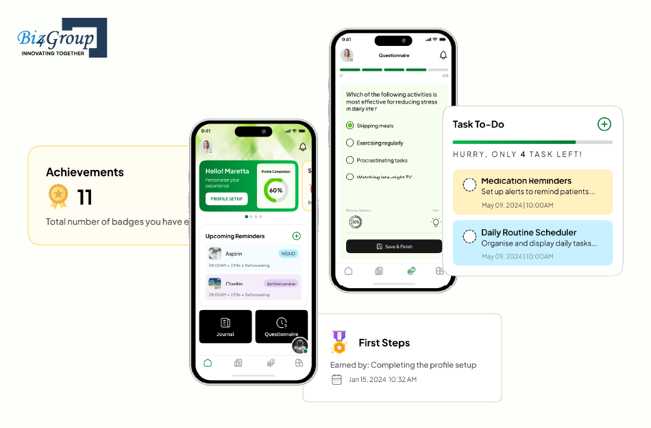
Cognitive decline is deeply personal—and deeply complex.
CogniHelp set out to create something more than just a memory aid.
They envisioned a compassionate, AI-powered companion that could help patients with dementia stay grounded, connected, and mentally engaged in their daily lives.
Biz4Group partnered with CogniHelp to design an app experience that’s not only functional but emotionally aware—giving patients a sense of control, and caregivers real-time insight into cognitive wellness.
CogniHelp was built to help individuals maintain routine, recall important information, and journal their day-to-day activities—all while gently tracking cognitive performance over time.
Here’s what we designed into the experience:
Challenge:
Creating a quantitative model to track cognitive ability over time.
Our Solution:
We developed a machine learning-based algorithm that interprets journal entries and quiz performance to offer a data-backed view of the patient’s cognitive trajectory.
This approach turns everyday interactions into clinically useful insight without disrupting the user’s natural routine.
Challenge:
Understanding how patients feel—not just what they say.
Our Solution:
Using GPT-4’s NLP capabilities, we designed an emotionally intelligent chatbot that not only communicates with kindness but captures subtle emotional signals.
This allows caregivers to adjust care plans based on real-time sentiment—not just symptoms.
Challenge:
Managing large volumes of sensitive data while keeping the experience simple
Our Solution:
We used PostgreSQL to build a robust, secure backend that can scale with user growth. On the front end, we designed daily reminders and notification flows that gently guide users to complete their journals without pressure or confusion.
CogniHelp isn’t just an app. It’s a digital ally for patients—and a powerful tool for caregivers.
And with Biz4Group’s thoughtful UI/UX design and AI integration, it’s making cognitive care smarter, kinder, and more human.
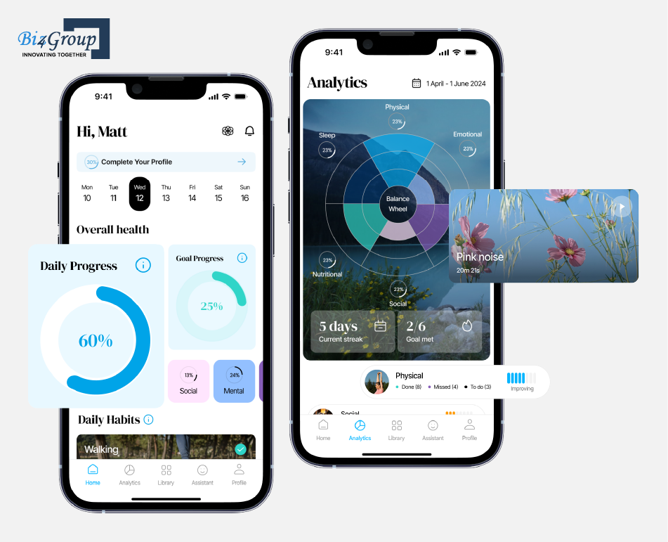
Personal growth isn’t one-size-fits-all—and Quantum Fit was built to prove exactly that.
In a world full of fitness trackers, meditation apps, and productivity tools, our client wanted to deliver something radically different: a unified AI-powered platform for holistic self-improvement.
Biz4Group partnered with Quantum Fit to turn that vision into reality—designing a sleek, intuitive app experience that guides users through their mental, physical, and emotional development with personalized insight and AI-driven support.
At its core, Quantum Fit uses advanced AI to deliver a personalized path to progress—helping users not just set goals but build better habits across every part of their lives.
Some of the standout features we designed include:
Challenge:
High AI token usage threatened app scalability.
Our Solution:
We engineered a smart token optimization strategy that prioritized lightweight, cost-efficient requests for routine tasks—reserving high-powered AI calls for complex, value-rich interactions.
Combined with intelligent caching, this kept the experience fluid and financially sustainable.
Challenge:
Every user has unique development goals and evolves over time.
Our Solution:
We made personalization the heart of the design. The AI learns user behaviors, adapts recommendations in real time, and serves evolving insights that grow with the user.
The result? A highly dynamic, individualized experience that stays relevant—day after day.
Quantum Fit is more than an app—it’s a daily companion for better living.
And at Biz4Group, we’re proud to have designed an experience that empowers users to improve not just one habit, but their whole lives.
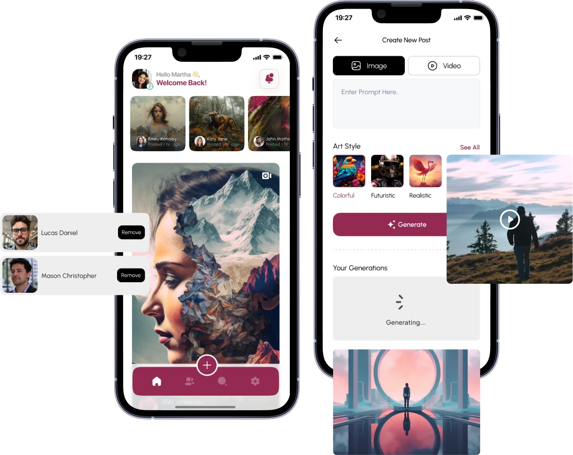
In the age of generative content, creativity is no longer limited by tools—it’s unleashed by design.
That’s exactly what AI-powered Social Media App set out to do: empower users to generate AI-powered images and videos with stunning simplicity.
Biz4Group partnered with AI-powered Social Media App to craft a sleek, immersive interface that transforms complex AI workflows into an intuitive creative playground—for both casual creators and power users alike.
AI-powered Social Media App brings next-gen content generation to users’ fingertips, leveraging Imagine 3 (Vertex AI) for text-to-image and Luma AI for text-to-video outputs.
But it’s the design that makes the technology feel human.
We engineered a visually consistent, responsive UI across platforms, delivering a seamless creative experience with:
Challenge:
Token-heavy AI calls were inflating costs, especially with repeated content generation.
Our Solution:
We built an intelligent caching system that stores generated content in a PostgreSQL database.
When the same or similar prompts were submitted, the system reused previous outputs—cutting token usage dramatically without compromising the user experience.
Challenge:
The platform needed to deliver a unified design across mobile and desktop.
Our Solution:
Using Ionic and React, we crafted a highly responsive layout that adapts to all screen sizes while maintaining performance and visual consistency—something we’ve perfected across various Android app development projects.
CSS Flexbox and Grid systems ensured optimal design flow and usability—no matter the device.
With AI-powered Social Media App, AI creativity meets effortless usability—and Biz4Group’s design thinking made it all possible.
We didn’t just build a tool. We helped launch a visual storytelling platform that feels as powerful as it is easy to use.
From designing emotionally intelligent chatbots to building pixel-perfect interfaces for generative AI platforms, we don’t just follow trends—we help businesses set them.
Whether you're reimagining productivity, wellness, or creativity, our team knows how to translate bold ideas into intuitive, user-first digital experiences.
If you're building something smart, make sure it's also beautifully usable.
Let’s create something your users actually want to come back to. Together.
AI can do a lot of things—schedule meetings, suggest workouts, even write you a birthday poem.
But without thoughtful design, it won’t do the one thing that actually matters: keep your users engaged.
Because at the end of the day, AI assistants aren’t just tools—they’re experiences.
And great experiences are always designed, never accidental.
If you’re ready to create your own AI business assistant, don’t just focus on what it can do—design how it makes people feel when they use it.
You’ve seen what works. You’ve seen what fails.
Now it’s your move.
Ready to create an AI assistant app your users won’t ghost after Day 1?
We can make it happen—with strategy, clarity, and a design-first approach that actually sticks.
Start by identifying repetitive, high-friction user interactions—think onboarding questions, scheduling tasks, or support queries. If these can be handled conversationally to save time and improve experience, an AI assistant could be a smart investment. But it should always solve a clear user need, not just be a tech flex.
Yes. In fact, good design often informs your roadmap. A well-thought-out UX prototype can help you test concepts early, validate use cases, and adjust priorities before development begins. You don’t need everything planned—just the right starting questions.
Brand personality doesn’t mean every reply needs to be witty or clever. It’s about consistent tone, visual style, and values across all touchpoints. If your brand is helpful, human, and calm—your assistant should sound the same, even when saying “I don’t know.”
Skip the pixel-perfect mockups at first. Use low-fidelity prototypes or no-code tools to simulate conversations and flows. Then test with real users—watch where they hesitate, how they respond, and what they expect. You’re not just testing features; you’re testing intuition.
Design is not “set it and forget it.” You should be iterating based on usage data, feedback, and evolving user behavior. Regular mini-audits (monthly or quarterly) can help spot drop-off points, confusing interactions, or missed engagement opportunities.
In many cases, yes. It depends on your app’s architecture and how modular your design system is. A good product and UX team can help you integrate an AI assistant in phases—starting with one high-impact feature, then expanding as it proves value.

with Biz4Group today!
Our website require some cookies to function properly. Read our privacy policy to know more.