 Location :
Orlando, FL, USA
Location :
Orlando, FL, USA +1 (407) 714-1616
 info@biz4group.com

 AI Summary Powered by Biz4AI
- Mental health app design in 2026 works best when it prioritizes emotional safety, visible privacy, and trust over visual polish or feature volume. Users often open these apps while anxious, exhausted, or in crisis, so every design decision should account for that state first.
- Trauma-informed UX design and privacy-first mental health app design are not optional add-ons, they are core requirements. Consent and data control need to be visible inside the app interface itself, not buried in a policy document nobody reads.
- Most mental health apps lose the majority of their users during onboarding, not after. Deferring account creation, shortening intake forms, and helping users reach real value within the first few minutes are the most effective ways to reduce early drop-off.
- Calming UI patterns, genuine accessibility, and ethical engagement separate mental health apps people trust from ones they abandon. Manipulative gamification and dark patterns damage trust faster in this category than in any other type of app.
- Biz4Group is a U.S.-based AI software development company with 20+ years of experience and 1,000+ successful projects, including AI-driven mental health and behavioral health applications. Building a mental health app that people actually trust requires clinical input, real user testing, and a development team that treats mental health app development best practices as a specialized discipline rather than a generic UX template.
Have you ever wondered why someone downloads a mental health app, opens it once with real intention, and then never comes back? You are not the only one asking. Most product teams ask it too, usually after the analytics dashboard delivers bad news.
The numbers are hard to ignore. One of the most detailed real world studies to date looked at 93 Android mental health apps with over 10,000 installs and found median 15 day retention sitting at just 3.9%. Only 3.3% of users were still active by day 30. That is not a rounding error. That is a product category quietly failing the people it was built to help.
And yet the market keeps growing. The global mental health apps industry is projected to reach USD 9.6 billion in 2026, climbing at a compound annual growth rate of 17.4% through 2035. So, the appetite is there. The money is there. What is missing, for most teams, is mental health app design that actually holds a user's attention long enough to help them.
We at Biz4Group have spent over 20 years building software for clients across healthcare, wellness, and behavioral health, and in that time we have shipped more than 1,000 projects with a team of 300+ engineers and designers. What we keep seeing, project after project, is that it is rarely the therapy content that falls short in a mental health app. It is almost always the design around it. A confusing onboarding flow. A privacy policy nobody can find until it is too late. An engagement tactic that feels more like a slot machine than support. These are design decisions, and every one of them is fixable.
So, what does it actually take to design something people trust enough to keep opening?
That is what this guide is for. We are walking through mental health app design patterns best practices, UX best practices for mental health apps, and the mental health app UI design best practices that separate apps people abandon from apps people rely on. This is not theory borrowed from a general UX playbook. It is practical, tested guidance for founders, CTOs, and product teams building something for users with anxiety, depression, or trauma histories. People who need the experience to feel safe before it can feel useful.
If you have already looked at some of the best mental health apps to explore on the market today, you have probably noticed they rarely win on features alone. They win on how safe the experience feels from the very first screen. That is exactly what we will break down here, section by section, starting with why this category plays by a different rulebook in the first place.
What Makes Mental Health App Design Different from Everyday App Design?
A mental health app is rarely someone's first choice. It's usually what they reach for when things already feel hard. That single fact changes how every screen, every button, and every line of copy needs to be designed.
23.4% of U.S. adults, roughly 61.5 million people, experienced a mental illness, according to data compiled by NIMH. Anxiety disorders alone affect 19.1% of adults, more than any other condition tracked. And despite that scale, less than half of people with a diagnosable condition receive any kind of care. That gap is exactly why demand for mental health apps keeps climbing, and exactly why the design decisions inside them carry real weight.
This is not an audience you can treat like the average app user. Someone opening your app might be doing it right after a panic attack, or right before telling someone for the first time that they're struggling. Patient-centered mental health app design starts with accepting that context, not designing around it as an afterthought. Here's what actually sets this category apart from a typical consumer app build.
The Emotional Stakes Are Higher Than Usual
A bad experience in a shopping app costs you a sale. A bad experience here can reinforce someone's belief that asking for help wasn't worth it. That's a different kind of failure, and it should be treated as one from the first product meeting, not discovered after launch through a one star review.
The Data Carries More Weight Than It Looks Like on a Schema Diagram
Mood logs, therapy notes, and crisis flags aren't just fields in a database. They're some of the most personal information a person will ever share with a piece of software. That's exactly why privacy-first mental health app design has to be part of the architecture from day one, not a compliance checkbox added at the end.
Trust Has to Be Earned Before Onboarding Even Finishes
In most apps, trust builds gradually over weeks of use. Here, a user often decides within the first two or three screens whether this app is safe enough to keep opening. There's no slow ramp up period to win them over.
Regulatory Exposure Shapes Design, Not Just Legal Paperwork
HIPAA, state privacy laws, and in some cases FDA classification as a medical device all factor into decisions that look purely visual on the surface, like what a consent screen says or how a crisis flow is structured. Design and compliance aren't separate workstreams here, they're the same one.
This is also why borrowing UX patterns wholesale from a fitness tracker or a productivity app tends to backfire. Something that reads as motivating in a habit app, like a broken streak or an aggressive push notification, can read as pressure or even judgment here. The person on the other end isn't trying to optimize a routine. They're trying to feel okay.
Every section after this one is about designing for that difference on purpose. Teams that get this right almost always have people who specialize in it involved early, which is a big part of why it's worth working with mental health app developers in the USA who've actually built for this population before, rather than adapting a general product team on the fly.
Building Something in This Space and Not Sure Where to Start?
Most mental health apps fail on design, not intent. Let's make sure yours doesn't.
Talk to Our TeamWhat Are the Mental Health App Design Principles Worth Building Around?
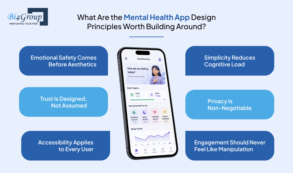
Every app in this category claims to be "user-centered." Almost none of them can explain what that actually means in a design review. That gap is where most mental health apps quietly fail their users, not in the big strategic decisions, but in dozens of small ones that never get held to a clear standard.
At Biz4Group, we treat these as non-negotiable ground rules, not aspirational values. They're the checklist we return to on every screen, every flow, and every feature decision, because mental health app design principles only matter if they survive contact with a real sprint deadline. Here's what we build around.
1. Emotional Safety Comes Before Aesthetics
A calming color palette means nothing if the flow underneath it still makes someone feel cornered or judged. Emotional safety is the actual design requirement here, visual softness is just one tool that serves it. This principle sets the tone for everything else on this list, and it's the first thing we test for in any empathetic UX for mental health apps review.
- No screen should make a user feel trapped or forced to continue
- Error states and setbacks are worded with compassion, not blame
- Every sensitive flow has a visible, easy way out
2. Simplicity Reduces Cognitive Load
Someone in a heightened emotional state has less bandwidth for figuring out a cluttered interface. The fewer decisions a screen demands, the more likely a user is to actually complete what they came to do. This is where mental health app usability best practices and clinical reality overlap directly.
- One primary action per screen instead of a menu of options
- Plain language over clinical or technical terminology
- Visual clutter and unnecessary steps removed by default
3. Trust Is Designed, Not Assumed
Trust doesn't happen because a footer says, "your data is safe." It happens because the product behaves in ways that consistently prove it, session after session. This principle threads through onboarding, data handling, and every touchpoint that follows.
- Transparent, plain-language explanations at the moment data is collected
- Consistent behavior across sessions, nothing that surprises the user
- Real human support pathways, not just automated responses
4. Privacy Is Non-Negotiable
Privacy can't live only in a settings menu or a legal document nobody reads. For this category, it has to be visible in the actual experience, because users are trusting you with information they may not have told anyone else in their life. We'll go deep on this in its own section further down, but it starts as a core principle here, not an afterthought bolted on before launch.
- Consent requested contextually, not buried in a wall of text at signup
- Data use explained in the interface itself, not just the privacy policy
- User control over what's stored, shared, or deleted, always accessible
5. Accessibility Applies to Every User
Mental health conditions themselves can be disabling, which means accessibility isn't a nice to have feature for a small segment of users. It's core to reaching the population this product exists for in the first place, and it directly shapes accessible mental health app design decisions from wireframe stage onward.
- Designs that work for varying digital literacy and age ranges
- Support for screen readers, keyboard navigation, and adjustable text
- Content that avoids unnecessary triggers or overwhelming visual noise
6. Engagement Should Never Feel Like Manipulation
Retention matters for the business, but the tactics used to get there matter just as much for the user. The line between motivating and manipulative gets crossed easily in this category, and crossing it erodes exactly the trust the rest of the app spent so much effort building.
- Progress and streaks framed around personal growth, not competition
- No dark patterns, guilt trips, or shame-based nudges to reopen the app
- Notifications and prompts that respect the user's state, not just their attention
These six principles aren't a checklist you complete once during a kickoff meeting. They're a filter every feature should pass through before it ships, which is exactly how we approach UI/UX design for every behavioral health product that comes through our team. Get these right early, and the harder, more specific decisions covered in the rest of this guide become a lot easier to make well.
How Does Trauma-Informed UX Design Make a Mental Health App Feel Safer?
Most product teams treat "trauma-informed" as a tone of voice decision. Write softer copy, use gentler colors, done. That's a surface read of a much deeper framework, and it's why so many apps that look calming still manage to feel unsafe once a user is a few screens deep.
SAMHSA outlines six core principles of a trauma-informed approach: safety, trustworthiness and transparency, peer support, collaboration and mutuality, empowerment and choice, and cultural and historical humility. These were built for clinical and organizational settings, but they translate directly into trauma-informed UX design for mental health apps when you treat each principle as a design constraint instead of a value statement on a slide.
The SAMHSA Framework, Applied to Product Decisions
Safety means a user should never wonder what happens next after they tap a button. Trustworthiness means the app behaves the same way every time, with no surprise data requests or sudden feature changes. Empowerment and choice mean the user always has a way to opt out, slow down, or say no, and that choice is never buried three menus deep.
Safe Exits Prevent Shame-Driven Drop-Off
A user who starts a journaling exercise or a crisis check-in and can't finish it shouldn't be met with a harsh "Quit" button. That single word can turn a moment of self-care into a moment of failure. A soft exit, something like "save for later" or "take a break," respects that stopping is sometimes the healthiest choice a person can make in that moment.
Designing Crisis Moments with Calm, Not Chaos
When a user shows signs of distress or flags a crisis, the interface needs to slow down, not scramble. Clear, simple language, one obvious next step, and an immediate path to real human support matter far more here than clever design. This is where mental health app interaction design gets tested under the most pressure it will ever face.
Language and Microcopy That De-Escalate, Not Trigger
Every word on a sensitive screen either lowers a user's stress or adds to it. Clinical jargon, urgency-driven phrasing, and guilt-based prompts all work against the goal here. Plain, warm, specific language does more to build mental health app design guidelines worth following than any visual polish ever will.
None of this replaces clinical oversight, and it shouldn't try to. What trauma-informed UX design does is make sure the interface never works against the care the product is trying to provide.
Why Do Users Abandon Mental Health Apps Before They Even Get Started?
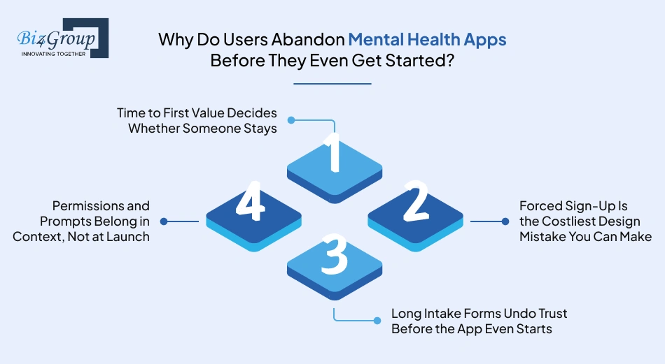
Most teams spend months perfecting the therapy content, the meditation library, and the mood tracking logic. Then they lose 70 to 80% of new users before any of it gets used. That's not a content problem. That's an onboarding problem, and it's one of the most fixable things in this entire guide.
Directionally, 70 to 80% of new users are lost within the first three days across mobile apps generally, and most of that loss happens in the very first session, before any real value is delivered. For a mental health app, that first session often carries extra weight, since the person opening it may already be running low on patience or energy. Mental health app onboarding best practices exist for exactly this reason, to protect that fragile first few minutes.
1. Time to First Value Decides Whether Someone Stays
The gap between download and the moment someone actually feels something useful happen is the single biggest lever in onboarding. Flows that get a user to real value in under ten minutes see dramatically lower abandonment than flows that take thirty minutes or more. For a mental health app, that first useful moment might be a two-minute breathing exercise or a single mood check-in, not a full assessment.
2. Forced Sign-Up Is the Costliest Design Mistake You Can Make
Asking for an account before a user has felt any value is one of the most expensive habits a product can have. Letting someone try a core feature in guest mode first, then asking for an account once they're already invested, consistently lifts activation. This single change often does more for retention than any feature built afterward.
3. Long Intake Forms Undo Trust Before the App Even Starts
Lengthy, repetitive intake processes, sometimes running 45 minutes with unclear instructions, are one of the biggest reasons patients disengage before care even begins. The same pattern shows up in consumer mental health apps. A wall of clinical questions on screen one asks for trust the app hasn't earned yet. Progressive disclosure, asking only what's needed for the very next step, respects both the user's time and their emotional bandwidth.
4. Permissions and Prompts Belong in Context, Not at Launch
Requesting notifications, location, or camera access in a blast at first launch feels like a demand. Asking for that same permission right when it's actually needed, tied to a feature the user just chose to use, earns a far higher opt-in rate and protects the trust that push-driven engagement depends on later.
The numbers back up how much is riding on this. Only about 19.2% of users complete onboarding on average, while top-performing apps see completion rates of 40 to 50%. That gap isn't talent or budget. It's almost always a handful of fixable decisions, deferred sign-up, shorter intake, contextual permissions, and a clear first moment of value. Getting the right combination of top mental health app features in front of a user early, without overwhelming them, is what turns that first session into a second one.
How Should Privacy Show Up in Mental Health App Design, Not Just the Backend?
A privacy policy sitting in a settings menu does nothing for a user's peace of mind if they never open it. And most people never do. If privacy only exists in a legal document, it might as well not exist at all from a design standpoint.
92% of Americans say they're concerned about how websites and apps collect their personal data, yet 41% admit they never actually read a privacy policy, according to a March 2026 survey. That gap between concern and awareness is exactly the problem. For a mental health app, that concern carries more weight than it does for a fitness tracker or a food log, which is why privacy-first mental health app design can't be treated as a backend issue that designers hand off to legal. It has to show up on screen, in language a user can actually understand, at the exact moment it matters to them.
1. HIPAA, GDPR, and 42 CFR Part 2 Now Shape UI Decisions, Not Just Legal Ones
A federal rule aligned 42 CFR Part 2 more closely with HIPAA, with a compliance deadline of February 16, 2026, which directly affects how apps serving users with substance use comorbidities need to handle consent and data sharing. If your app supports users with depression, anxiety, PTSD, or burnout, it's safest to assume some crossover with these regulations and design consent flows accordingly, not bolt them on after the fact. Getting this right from the ground up is a big part of why teams building a HIPAA compliant AI app bring compliance into the design process early instead of retrofitting it before launch.
2. Consumers Won't Share Sensitive Health Data Without Real Consent
68% of consumers say they're unwilling to share sensitive health data without explicit consent, based on 2026 data. A single "I agree" checkbox at signup doesn't give a user that kind of real control, it just gets them past a wall. Effective mental health app privacy design best practices ask for consent contextually, right when a specific piece of data is being collected, with plain language explaining exactly what it's used for and who can see it.
3. Personalization Without Feeling Surveilled
Mood and behavior data can genuinely improve an app's recommendations, but the moment personalization feels like it's watching rather than helping, trust breaks. The fix isn't avoiding personalization altogether, it's giving users visible control over what gets tracked, the ability to see why a suggestion was made, and an easy way to turn any of it off. That transparency is what separates ethical mental health app design from a system that simply optimizes for engagement, and it's exactly the kind of groundwork solid AI compliance practices are meant to support as personalization features get more advanced.
4. Data Control Should Be as Easy to Find as the Home Screen
52% of consumers say they would stop using a service entirely if they couldn't manage their own stored data. Users should never have to dig through three settings menus to find out what's being stored or how to delete it. A visible, accessible data control panel does more for trust than any privacy policy language ever will, because it proves the app means what it says instead of just stating it once and hoping nobody checks.
Privacy done this way isn't a constraint on good design. It's part of what makes the rest of the experience feel safe enough to actually use.
Is Your App's Privacy Actually Ready for 2026 Regulations?
HIPAA, 42 CFR Part 2, and visible consent aren't things to figure out after launch.
Get a Compliance-Ready Design ReviewWhat Do the Best Mental Health App UI Design Patterns Include in 2026?
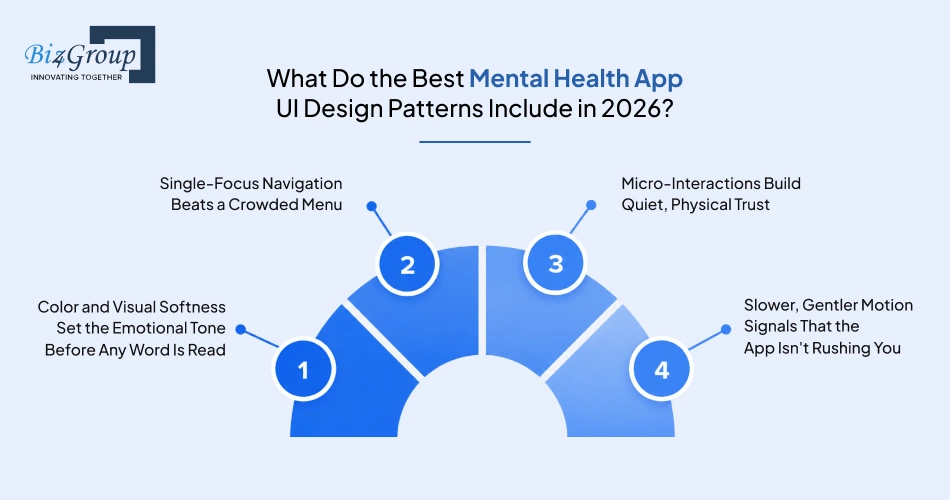
A user doesn't read your app before deciding whether to trust it. They feel it. 94% of first impressions are design-driven, and that judgment forms in roughly 0.05 seconds, according to 2026 usability research. For most apps, that's a stat about conversion. For a mental health app, it's a stat about whether someone in a fragile moment decides to stay or close the app and go back to feeling alone with whatever brought them there.
That's the real weight behind mental health app UI design best practices. The visual layer isn't decoration sitting on top of the product, it's often the first and fastest signal a user gets about whether this app is safe.
1. Color and Visual Softness Set the Emotional Tone Before Any Word Is Read
High-contrast colors, sharp edges, and busy layouts read as energetic in a productivity app and as alarming in a mental health one. Desaturated blues, greens, and other muted tones create a sense of stability that a user registers almost instantly, well before they process any copy on the screen. This is one of the clearest examples of mental health app interface design best practices working quietly in the background, doing its job without ever calling attention to itself.
2. Single-Focus Navigation Beats a Crowded Menu
A home screen with twenty options doesn't feel like flexibility to someone who's anxious or exhausted, it feels like a decision they don't have the energy to make. The strongest best mental health app UI design patterns 2026 strip navigation down to one clear, primary action based on what the user most likely needs right now, with everything else a tap away instead of competing for attention up front.
3. Micro-Interactions Build Quiet, Physical Trust
Small details, a soft haptic pulse when a thought gets logged, a gentle transition after a breathing exercise, do more for perceived safety than most people expect. These moments give a user a subtle sense of "this worked" or "you're okay" without a single word of copy. This is where mental health app design trends 2026 are heading, away from loud visual feedback and toward interactions that feel calm and grounded instead of gamified.
4. Slower, Gentler Motion Signals That the App Isn't Rushing You
Sharp, snappy transitions work well in apps built for speed and efficiency. Here, that same energy can feel like pressure. Slower animation timing, softer easing curves, and transitions that don't demand instant reaction all communicate the same underlying message, that there's no rush, and the user is allowed to move at their own pace.
None of these patterns work in isolation. Color without calm navigation still feels chaotic. Soft motion without accessible contrast still excludes users who need it. The strongest best UI patterns for mental health apps treat visual design as one coordinated system built around a single goal, making the interface feel like it's stepping back so the person using it can actually focus on their own wellbeing.
Is Your Mental Health App Actually Accessible, or Just Compliant on Paper?
Most teams treat accessibility as a legal checkbox to clear before launch. That framing misses something important for this category specifically, inaccessible design doesn't just exclude someone with a disability, it can actively work against the mental wellbeing your app exists to support.
95.9% of the top one million homepages had at least one detectable WCAG failure in the 2026 WebAIM Million report, the first regression in six years after gradual progress. That's the general web. For accessible mental health app design specifically, the stakes are higher than a missed conversion or a lawsuit risk, since the population this category serves overlaps heavily with people who experience cognitive, sensory, or attention-related challenges alongside their mental health condition.
1. Accessibility Failures Can Be a Mental Health Trigger, Not Just a Barrier
A screen reader that can't parse a crisis flow, a color scheme with poor contrast that strains eyes already fatigued by anxiety, or a rigid interface that punishes a moment of confusion all do more than exclude a user. They can actively worsen the state that user came to the app to manage. Treating mental health app accessibility best practices as core UX rather than a legal add-on is what separates a genuinely inclusive mental health app design from one that simply passes an automated scan.
2. Design for the Full Range of Digital Literacy and Age
This category serves a wider age and skill range than most product categories, teenagers managing anxiety, older adults navigating grief, and everyone in between with varying comfort using apps at all. That means adjustable text sizing, uncomplicated navigation that doesn't assume prior app fluency, and clear, jargon-free labeling matter just as much as any WCAG checkbox.
3. The Technical Practices That Actually Move the Needle
A handful of fixes consistently make the biggest difference: sufficient color contrast ratios for text and interactive elements, descriptive labels on buttons and icons for screen reader users, reduced motion settings for users with sensory sensitivities, and keyboard navigability for anyone who can't or doesn't want to rely on touch or a mouse. None of these require reinventing the interface, they require building it correctly the first time.
4. Cognitive Accessibility Deserves the Same Attention as Visual Accessibility
Standard WCAG guidance was written primarily with visual and motor disabilities in mind, but cognitive accessibility, plain language, predictable layouts, minimal working memory demands, matters just as much for a population already dealing with reduced bandwidth from anxiety, depression, or trauma. This is where a general accessibility checklist and true mental health app accessibility best practices start to diverge.
5. Accessibility Is a Business Case, Not Just an Ethical One
26% of U.S. adults live with some form of disability, representing an estimated $13 trillion in global purchasing power. Building accessibility in from the start isn't just the right call for a vulnerable user base, it's a direct expansion of who can actually use and pay for your product.
Accessibility done well doesn't announce itself. Nobody notices good contrast or clear labeling, they just notice that the app works. That quiet reliability is exactly the standard this category should be held to.
What Are the Steps to Designing a Mental Health App People Actually Trust?
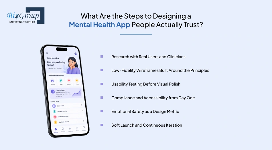
Every principle covered so far in this guide means nothing until it survives an actual design process. This section is about that process, the sequence that turns emotional safety, privacy, and trauma-informed thinking into a real product instead of a values statement nobody follows once the deadlines hit.
This is our working mental health app design checklist at Biz4Group, refined across the healthcare and wellness products we've built. It's not the only way to do this, but it's a sequence that consistently protects the parts of the experience that matter most.
Step 1: Research with Real Users and Clinicians
Design work that starts in a design tool instead of in conversation with real users and a licensed clinician tends to produce something clinically hollow, no matter how polished it looks later. Interviews with the actual target audience, paired with clinical input from day one, ground every decision that follows in lived experience instead of assumption.
- Interview real target users about what made past mental health tools feel safe or unsafe
- Bring a licensed clinician into early discovery, not just a final review
- Map the emotional journey a user goes through, not only the feature journey
Step 2: Low-Fidelity Wireframes Built Around the Principles
This is where mental health app design principles stop being ideas on a slide and start becoming actual screens. Working in low fidelity first keeps the team focused on flow and emotional safety before anyone gets attached to colors or polish that's expensive to undo later.
- Sketch core flows, onboarding, check-ins, crisis paths, before any visual design begins
- Flag every screen that touches sensitive data or a vulnerable moment
- Keep navigation to one primary action per screen from the first draft
Step 3: Usability Testing Before Visual Polish
Usability testing on a wireframe catches expensive mistakes while they're still cheap to fix. Waiting until the interface looks finished before testing means structural problems get discovered far too late, once changing them costs real time and budget.
- Run moderated sessions with people who reflect the actual target audience
- Watch for hesitation, confusion, or discomfort, not just task completion
- Test crisis and sensitive flows specifically, not only the easy path
Step 4: Compliance and Accessibility from Day One
Retrofitting HIPAA-aligned consent flows or accessibility fixes after visual design is finished is slower, costlier, and usually produces a weaker result. Treating both as design requirements from the wireframe stage is one of the clearest markers of genuine mental health app development best practices.
- Design consent and data flows alongside the wireframes, not after
- Check color contrast and screen reader flow before high-fidelity design begins
- Loop in a compliance advisor early enough to actually shape decisions
Step 5: Emotional Safety as a Design Metric
Task completion rate tells you if someone finished a flow. It doesn't tell you if they felt safe doing it. Measuring the emotional read of an experience, not just its functional success, is what keeps user-centered mental health app design honest past the wireframe stage.
- Collect qualitative feedback on how a flow felt, not only whether it worked
- Watch for silent drop-off points that standard usability testing alone might miss
- Revisit copy and pacing based on real user reactions, not internal assumptions
Step 6: Soft Launch and Continuous Iteration
A soft launch with a smaller group surfaces real retention and engagement data before a full rollout locks in any mistakes at scale. This step turns the retention numbers covered earlier in this guide into an active monitoring practice instead of a cautionary statistic.
- Track day one, day seven, and day thirty retention from the first release
- Treat drop-off points as design signals, not just numbers on a dashboard
- Keep iterating after launch instead of treating version one as the finished product
None of these steps work well in isolation, and skipping one to save time almost always costs more later. This is also exactly why it matters who's running this process. Knowing how to choose a top mental health app development company in the USA often comes down to whether a team actually follows a sequence like this one, or treats it as an afterthought behind a faster, cheaper build.
What Mental Health App Design Mistakes Should You Avoid, and How Do You Fix Them?
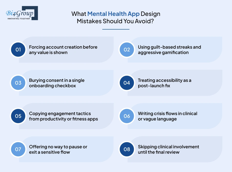
Most of these mistakes don't come from a lack of skill. They come from applying general app design instincts to a category where those instincts work against you. Research shows dark patterns and manipulative design tactics affect vulnerable users more significantly, since they tend to have more trusting, impressionable relationships with the products they rely on, which is exactly why this category deserves a different standard than the one most teams default to.
Here's where we consistently see mental health app design go wrong, and what actually fixes it.
|
Mistake |
Why It Backfires |
How to Fix It |
|---|---|---|
|
Forcing account creation before any value is shown |
Users abandon before they've experienced anything worth staying for, and this is one of the most expensive onboarding mistakes a team can make |
Offer a guest mode or let users try one core feature first, then ask for an account once they're already invested |
|
Using guilt-based streaks and aggressive gamification |
What motivates in a habit app reads as pressure or shame here, and can actively discourage someone from returning after a missed day |
Frame progress around personal growth, not unbroken streaks, and always offer a no-guilt way to pick back up |
|
Burying consent in a single onboarding checkbox |
Users can't meaningfully consent to something they never actually read, which quietly erodes trust in privacy-first mental health app design from day one |
Ask for consent contextually, at the moment specific data is collected, in plain language tied to that exact use |
|
Treating accessibility as a post-launch fix |
Retrofitting contrast, labeling, and screen reader support after visual design is finished is slower and weaker than building it in from the start |
Check accessibility at the wireframe stage, before high-fidelity design begins, as part of mental health app design standards, not a QA afterthought |
|
Copying engagement tactics from productivity or fitness apps |
Notifications and rewards built for habit-building can feel invasive or judgmental in a context built around emotional vulnerability |
Design prompts around the user's actual state, and test whether a feature motivates or pressures before shipping it |
|
Writing crisis flows in clinical or vague language |
Under stress, users need immediate clarity, not language that requires interpretation or adds cognitive load at the worst possible moment |
Use direct, warm, specific language in every crisis and escalation flow, tested with real users under simulated pressure |
|
Offering no way to pause or exit a sensitive flow |
A hard "Quit" button on a journaling or crisis exercise can turn stopping into a moment of failure instead of a valid choice |
Replace it with a soft exit like "save for later," acknowledging that stopping is sometimes the healthiest option |
|
Skipping clinical involvement until the final review |
Design decisions made without clinical input early tend to look right and function wrong, catching real problems only after launch |
Involve a licensed clinician from discovery onward, not as a final sign-off step before release |
There's a real business case behind fixing these, not just an ethical one. Apps recommended by healthcare providers see roughly 10% higher retention and keep users engaged an average of 30 days longer, which tends to happen naturally when the product itself earns that kind of trust instead of manufacturing engagement through pressure. Done right, thoughtful mental health gamification can absolutely support retention, the difference is whether it's built around genuine progress or built to exploit a habit loop.
Every mistake on this list is fixable, and every fix is cheaper the earlier it happens in the process.
How We Bring These Principles to Life in Real Mental Health Apps
Everything covered so far in this guide sounds reasonable on paper. The real test is whether it holds up in an actual build, with real data, real users, and real constraints. Here are two projects from our own portfolio that put these principles into practice, in ways that go beyond a typical consumer wellness app.
AI Chatbot for Personalized Veteran Support: Designing for Crisis, Not Just Convenience
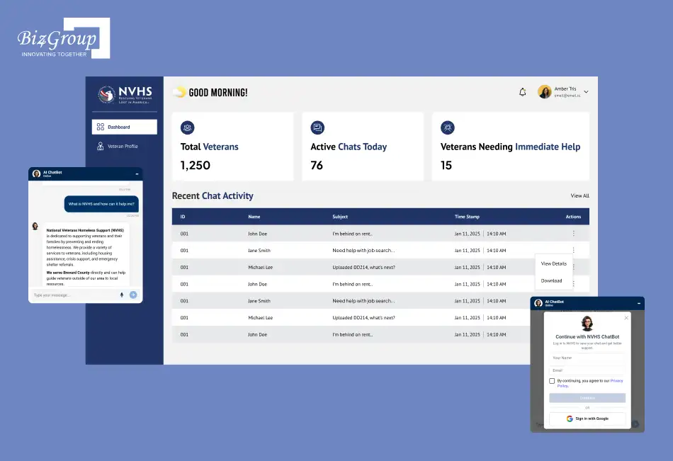
This project involved building an AI chatbot for NVHS to support homeless and at-risk veterans across the U.S., many of whom were navigating housing instability, healthcare gaps, and mental health crises with no clear starting point. The existing system, government websites and long helpline waits, was failing exactly the population it was meant to serve. Our goal was to make help feel human, immediate, and available without barriers, through a simple voice or text conversation.
The Challenge: Real-time crisis detection across live conversations, at scale, with no room for delay. A user mentioning suicidal thoughts or an urgent housing emergency needed to be identified the moment it happened, not reviewed after the fact.
How We Solved It: We built real-time sentiment and keyword scanning into every conversation. The moment an urgency signal appeared, the chatbot immediately surfaced crisis resources to the user while simultaneously alerting NVHS staff through an admin dashboard, so a human could step in before the moment passed. This is exactly the kind of AI mental health app development work where the technology has to disappear behind the outcome, nobody using this in crisis should have to think about the AI at all.
A second, quieter challenge shaped the whole product just as much: many users were elderly or not especially comfortable with technology. The team built the entire interface around voice and text input rather than assuming touch fluency or app familiarity, and paired it with secure, HIPAA-compliant data handling so trust wasn't just promised, it was structurally built in from the start.
CogniHelp: Designing for Patients Whose Memory and Trust Work Differently
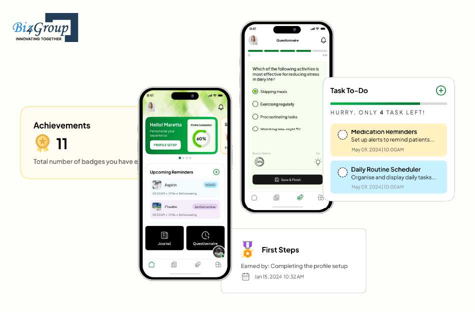
CogniHelp is a mobile app built to support people in the early to mid stages of dementia, helping with daily orientation, journaling, and emotional check-ins. This is about as high-stakes as patient-centered mental health app design gets, since the users themselves may not remember using the app the day before, let alone why it's asking them to complete a task.
The Challenge: Building a chatbot that could accurately read emotional signals from patients whose communication patterns shift as the condition progresses, while also making sure patients would actually complete their daily journaling without added stress or confusion.
How We Solved It: The team used GPT-4's natural language capabilities to build a chatbot genuinely capable of picking up on emotional cues in patient interactions, giving caregivers real insight into how someone was actually feeling, not just what tasks got completed. For the completion problem, the fix wasn't more aggressive notifications, it was gentler ones. Reminders were designed to nudge without pressuring, respecting that a missed journal entry is a symptom of the condition, not a failure to design around.
Behind the scenes, the team also had to solve for something less visible but just as important: measuring cognitive performance over time without turning the app into a clinical instrument that felt cold or alienating. A custom model combined quiz results and journal entries into a single, trackable measure of cognitive ability, letting the app support real clinical insight while still feeling like a companion rather than a test.
What Both Projects Prove
Neither of these apps could have worked with a generic UX template. Crisis detection, emotional safety, and gentle persistence had to be built into the architecture itself, not layered on as a feature after the fact. That's the difference between an app that technically functions and one that earns the trust of the people who need it most, and it's the same standard we bring to every mental health and behavioral health project we take on, whether it's a full build or designing an AI agent for a specific piece of the experience.
Ready to Build the App Users Actually Keep Opening?
We've done it for veterans in crisis and dementia patients who forget they opened the app yesterday. Imagine what we could do for yours.
Start Your Project With Biz4GroupWrapping This Up!
Every section in this guide points back to the same core idea: technical execution and human sensitivity are not two separate workstreams in mental health app design. They are the same job, done well or done poorly, and the difference shows up in whether someone opens your app tomorrow.
What's the single most important thing to get right in mental health app design? If we had to compress this entire guide into one answer, it would be this: design every decision as if the person on the other end is having a harder day than usual, because for a meaningful share of your users, that's exactly true. Emotional safety, visible privacy, trauma-informed flows, and accessible interfaces aren't separate checkboxes. They're different expressions of that one underlying commitment.
We've spent this guide walking through best practices for mental health app design because we've lived the consequences of getting it wrong, and the payoff of getting it right, across real projects with real users depending on the outcome. Twenty years in software, a thousand-plus shipped projects, and a portfolio that includes crisis-detection systems for at-risk veterans and cognitive support tools for dementia patients have taught us that this category doesn't forgive shortcuts. It rewards teams willing to slow down at exactly the moments most product roadmaps try to speed up.
If you're building or rethinking a mental health product right now, the path forward isn't complicated, even if it's demanding. Start from emotional safety. Build privacy into the interface, not just the backend. Test with real users and real clinicians before a single pixel gets polished. And work with a team that treats this category as its own discipline, not a reskin of a fitness app. That last part is exactly why founders looking for professional web design for behavioral health practices tend to end up talking to specialized teams like Biz4Group, one of the top UI/UX design companies in the USA with hands-on experience building specifically for vulnerable, high-stakes user bases.
Mental health apps don't succeed by being the loudest or the most feature-packed. They succeed by being the ones people trust enough to come back to on their hardest day. Build for that, and the retention numbers, the reviews, and the impact tend to follow on their own.
Got an idea worth building right, not just building fast? Let's talk before your competitor does.
FAQs
1. What makes a good mental health app design?
A good mental health app design puts emotional safety ahead of visual polish, gives users a clear sense of control over their data, and never makes someone feel pressured, judged, or trapped inside a flow. The strongest apps in this category are built around calm, single-focus screens, plain language, and consent that's visible in the interface itself, not buried in a settings menu.
2. How should mental health apps be designed for vulnerable users?
Design for vulnerable users starts with assuming reduced patience and energy, not average attention spans. That means shorter onboarding, softer error messages, visible exit paths on any sensitive flow, and language reviewed against real user feedback rather than internal assumptions. This is the foundation of genuine trauma-informed UX design for mental health apps, and it should shape every screen, not just the crisis flows.
3. What makes mental health app onboarding effective?
Effective mental health app onboarding best practices get a user to one moment of real value, a breathing exercise, a first mood check-in, before ever asking for an account. Long intake forms and forced sign-up are the two biggest reasons users abandon before they've even started, so deferring both until trust is established consistently improves activation.
4. How should privacy be incorporated into mental health app UX?
Privacy should live in the interface, not just the legal document nobody reads. Contextual consent requests, plain-language explanations of what data is collected and why, and an easily accessible data control panel are what separate genuine privacy-first UX design for mental health apps from a policy that technically exists but nobody trusts.
5. How much does it cost to build a mental health app like BetterHelp?
Cost varies widely based on scope, but a platform with therapist matching, secure messaging, video sessions, and compliance infrastructure typically requires a significantly larger investment than a standalone journaling or meditation app. If you're scoping something in that direction, it helps to look at what it actually takes to design an AI app with that level of complexity, and to review a breakdown of what building a mental health app like BetterHelp actually involves before locking in a budget.
6. Should a mental health app integrate with EHR systems?
For apps working alongside licensed providers or clinical care, EHR integration is often worth the added complexity, since it keeps patient history, medication data, and provider notes connected instead of siloed. It's not necessary for every consumer wellness app, but for anything positioned as part of a broader care journey, understanding EHR integration for mental health platforms early prevents a costly rebuild later.
7. What role does AI play in mental health app design?
AI can support personalization, crisis detection, and emotional tone analysis, but it works best when it stays in a supporting role rather than replacing human judgment on anything sensitive. Applied well, AI for UX design helps teams test flows faster and catch friction earlier, though every AI-driven suggestion in a mental health context still deserves a human and, where appropriate, a clinician reviewing it before it ships.
